Table of Contents
ToggleElements and Principles of Design
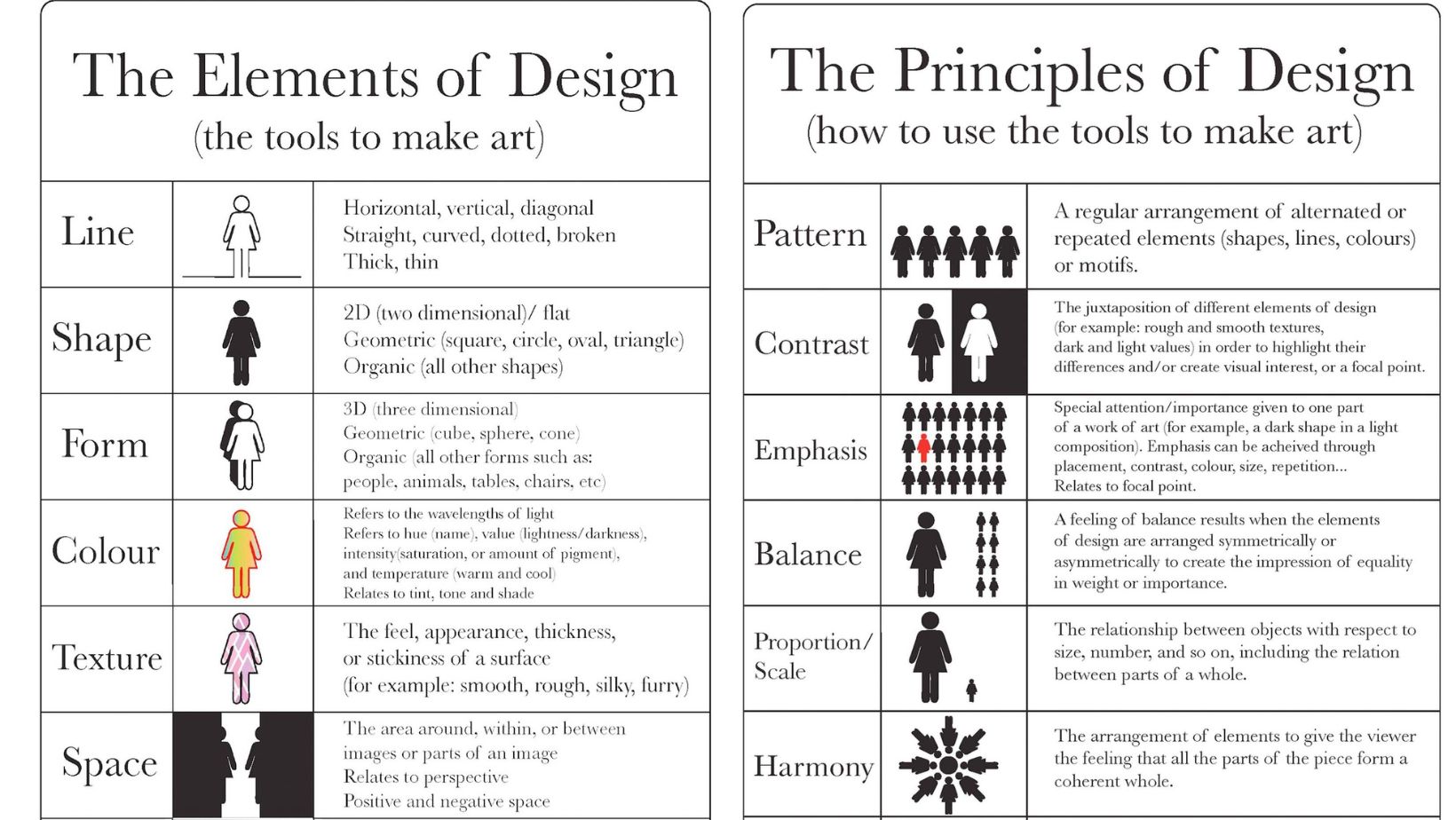
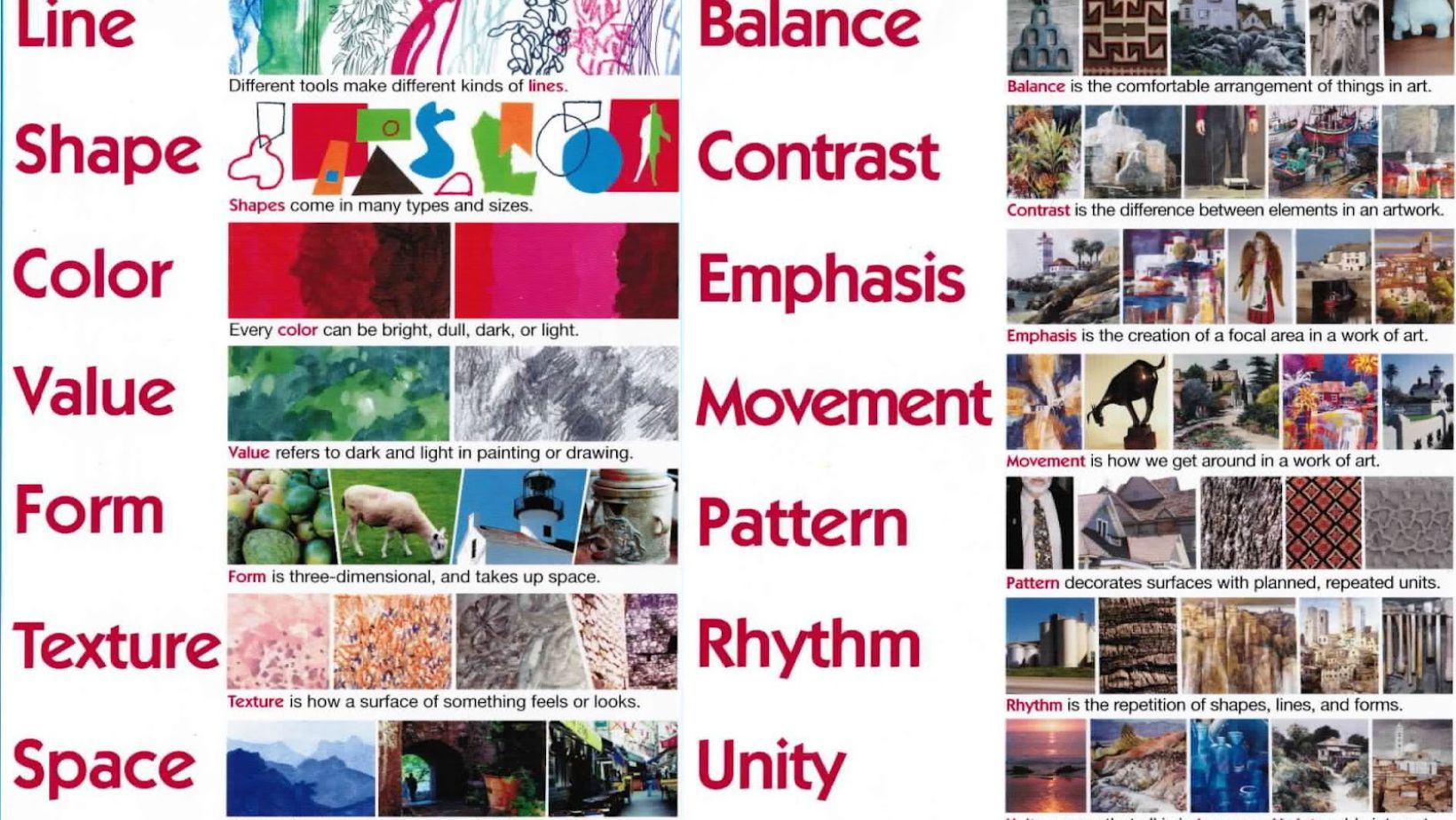
As an expert in design, I’ll delve into the elements and principles of design to provide you with a comprehensive understanding of how they shape visual compositions. When we talk about design elements, we refer to the basic units used in any visual piece. These include line, shape, color, texture, space, and form. Each element plays a crucial role in conveying messages, evoking emotions, and guiding the viewer’s eye across the composition.
Moving on to elements and principles of design, these are the guidelines that govern how we use those elements effectively. Key principles such as balance, contrast, emphasis, movement, pattern, rhythm, and unity help designers create harmonious and impactful designs. By mastering these principles, designers can achieve coherence and visual interest in their work.
Understanding how elements and principles of design interact with each other within the framework of principles is essential for creating visually compelling designs that resonate with viewers. Whether you’re a seasoned designer or just starting in the field, grasping these foundational concepts will elevate your design skills and enable you to craft engaging visuals that captivate audiences.

Understanding the Elements of Design
When diving into the world of design, it’s crucial to grasp the fundamental building blocks that form its core – the elements of design. These key components serve as the foundation for every creative endeavor, influencing how a piece is perceived and experienced by its audience.
Key Elements to Consider
- Line: Lines can be straight, curved, thick, thin, or jagged, playing a vital role in guiding the viewer’s eye and creating structure within a composition.
- Color: Color evokes emotions and sets the mood of a design. Understanding color theory helps designers choose palettes that resonate with their intended message.
- Shape: Shapes are defined by boundaries and can be geometric or organic. They add interest and depth to designs while conveying different meanings based on their form.
Exploring Texture and Space
- Texture: Texture refers to the surface quality of an object in a design. It can be tactile or visual, adding richness and dimension to artwork.
- Space: Space deals with how elements are arranged within a composition. By manipulating positive (occupied) and negative (empty) space, designers create balance and hierarchy in their designs.
The Impact of Form and Pattern
- Form: Form gives objects volume and mass in a design. Understanding how form interacts with light and shadow is essential for creating realistic representations.
- Pattern: Patterns are repetitive motifs that bring rhythm and cohesion to a composition. They can range from simple geometrics to intricate designs found in nature.
By delving into these elements of design, creators can enhance their work’s effectiveness and visual appeal. Mastering these foundational principles opens up endless possibilities for crafting compelling visuals that resonate with audiences across various mediums.

Exploring the Principles of Design
When delving into the realm of design, understanding the PRINCIPLES that underpin exceptional creations is paramount. These principles serve as the foundation upon which all visually appealing compositions are built. Let’s peel back the layers and uncover what makes these design principles so crucial.
Balance: One of the key principles in design is BALANCE. It involves achieving equilibrium among various elements within a composition. There are three main types of balance: symmetrical, asymmetrical, and radial. Symmetrical balance creates a sense of harmony through mirroring elements, while asymmetrical balance relies on contrast to maintain visual stability. Radial balance emanates from a central point outward, creating a dynamic feel.
Contrast: CONTRAST adds interest and depth to a design by juxtaposing different elements against each other. Whether it’s through variations in color, size, texture, or shape, contrast helps highlight key features and guide the viewer’s eye across the composition.
Emphasis: EMPHASIS directs attention to a focal point within a design. By strategically enhancing certain elements over others, designers can create hierarchy and significance in their work. Through techniques like color saturation, size scaling, or positioning, emphasis ensures that essential components stand out prominently.
Unity: UNITY ties together all elements in a design to form a cohesive whole. It establishes consistency and coherence by aligning various parts around a central theme or concept. Achieving unity requires careful consideration of typography choices, color palettes, spacing, and overall layout to ensure everything works harmoniously together.

