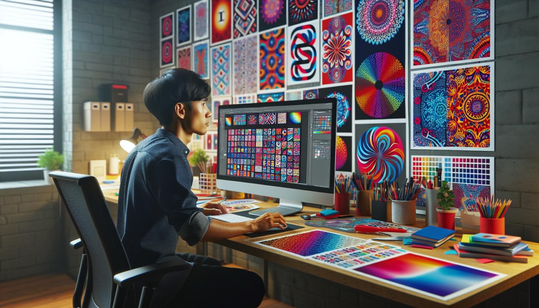
Repetition is a powerful design principle that creates harmony and unity in visual compositions. By consistently using patterns, colors, or shapes, designers can evoke emotions and guide the viewer’s eye through a piece. This technique not only enhances aesthetic appeal but also strengthens brand identity, making it memorable and recognizable.
One striking example of design unified through repetition can be found in nature, where patterns like the arrangement of leaves or the symmetry of flowers showcase this principle beautifully. In the world of graphic design, brands often employ repetition to create cohesive marketing materials. Understanding how repetition works can inspire designers to elevate their own projects, ensuring that every element contributes to a unified vision.
Table of Contents
ToggleFind an Example of a Design Unified Through Repetition
Repetition in design plays a crucial role in establishing unity and coherence in visual compositions. It creates a recognizable style, enhancing emotional engagement and brand recall.
Importance of Repetition in Design
Repetition helps create an organized framework in design. It fosters recognition, making elements easily identifiable for viewers. For example, brands like Coca-Cola use repeated logo placements across various platforms, reinforcing their identity. By consistently applying visual themes, designers instill trust and familiarity. Cohesive designs encourage audience connection, prompting positive emotional responses.
Various Forms of Repetition
Repetition manifests in several ways:
- Patterns: Repeating shapes or motifs, such as stripes in textiles or wallpapers, creates visual rhythm.
- Colors: Consistent color schemes across marketing materials help establish a brand’s identity. For instance, Target uses red to maintain a unified brand aesthetic.
- Fonts: Utilizing the same typeface across print and digital media supports legibility and brand recognition.
- Layouts: Consistent layouts across webpages or advertisements guide user navigation, promoting usability.
These forms enhance the effectiveness of designs, ensuring that messages resonate with audiences and align with the overarching design vision.
Finding an Example of a Design Unified Through Repetition
Repetition creates a visual language that unifies designs across various contexts. Two standout examples in architectural and graphic design demonstrate how this principle fosters coherence and recognition.
Case Study: Architectural Design
The Sydney Opera House exemplifies architectural design unified through repetition. Its iconic roof shells feature a repeating composition that evokes the imagery of sails, creating a memorable silhouette against the harbor. The consistent use of geometric shapes throughout the structure enhances visual harmony. Repeated motifs appear in both the interior and exterior, contributing to a cohesive identity. This unity attracts visitors and reinforces the landmark’s status while highlighting the power of repetition in architectural aesthetics.
Case Study: Graphic Design
Coca-Cola’s branding serves as a prime example of graphic design unified through repetition. The fluid script logo appears consistently across all advertising campaigns, merchandise, and packaging. This repeated visual element builds brand recognition and emotional connections with consumers. Furthermore, the strategic use of red and white colors creates a unified identity that stands out in crowded markets. Each advertisement follows a consistent layout, ensuring brand messages resonate while maintaining a recognizable style. Repetition in graphic design not only reinforces identity but also guides viewer engagement through familiar visual signals.
Analyzing the Impact of Repeated Elements
Repeated elements significantly impact design, fostering visual cohesion and enhancing brand recognition. By employing consistent motifs, designers create unforgettable experiences for viewers.
Visual Cohesion
Visual cohesion stems from repeated elements that drive unity and clarity. Patterns, shapes, and colors serve as anchors within a design, guiding the viewer’s eye and establishing a consistent rhythm. For instance, in web design, using a specific color palette throughout a site unifies various pages, creating a seamless user experience. Projects like the Google homepage showcase visual cohesion through minimalistic design elements, establishing familiarity and ease of navigation. Designers often leverage repeated motifs in textile patterns or interior designs, reinforcing an aesthetically pleasing environment.
Brand Recognition
Brand recognition relies heavily on the strategic use of repeated design elements. Consistent branding techniques, such as logos, typography, and color schemes, enhance memorability. Companies like Apple utilize a sleek logo and minimalistic design across products, reinforcing a strong visual identity. McDonald’s golden arches consistently appear across advertising materials, reinforcing consumer recall and connection. Through repetition, brands establish a coherent identity that viewers quickly recognize, fostering loyalty and emotional attachment. Brands that effectively implement repetition ensure their message resonates powerfully, creating impactful engagements with their audiences.
Practical Applications of Repetition in Design
Repetition in design serves practical purposes, enhancing unity and coherence across various applications. Designers can effectively communicate messages and establish brand identity by strategically using repeated elements.
Tips for Designers
- Establish a Pattern: Choose specific patterns or motifs and incorporate them consistently across designs.
- Select a Color Palette: Utilize a limited color palette that reinforces brand identity while promoting visual harmony.
- Utilize Typography: Stick with a few font styles and sizes to maintain a cohesive look throughout the design.
- Design Layouts: Implement a uniform layout structure in marketing materials for clarity and brand recall.
- Create Visual Rhythm: Arrange elements in a way that guides the viewer’s eye, enhancing engagement and retention.
- Maintain Balance: Balance repeated elements with unique features to prevent monotony in design.
- Incorporate Variety: Use variations in size, color, or style to keep designs interesting while retaining a unified look.
- Focus on Purpose: Ensure that every repeated element serves a clear purpose within the design context to avoid unnecessary clutter.
- Regularly Review: Assess designs periodically to identify areas where repetition becomes overwhelming and make adjustments as needed.
- Solicit Feedback: Gather opinions from peers or users to gain insights on the effectiveness of repeated elements without detracting from overall design quality.
Design Through Repetition
Repetition in design is a powerful tool that fosters unity and coherence. By consistently applying patterns, colors, and shapes, designers can create memorable experiences that resonate with audiences. This principle not only enhances aesthetic appeal but also strengthens brand identity, making it easier for consumers to recognize and connect with brands.
The examples highlighted throughout the article demonstrate that effective repetition can transform ordinary designs into cohesive visual narratives. Whether in architecture or graphic design, the strategic use of repeated elements ensures that messages are clear and impactful. Embracing repetition allows designers to craft a unified vision that captivates and engages, ultimately leaving a lasting impression.


