
Use a stained-glass lamp to guide living room colours, textures and accents, with practical advice on placement, pattern and lighting.
A living room can contain perfectly serviceable furniture and still feel difficult to finish. The sofa works, the walls are freshly painted, and the rug fits, yet choosing cushions or artwork becomes a sequence of unrelated decisions. One way to bring those choices together is to start with an object that already contains a considered arrangement of colour.
A stained-glass lamp offers precisely that starting point. Its shade brings together coloured glass, dark outlines and changes in transparency within a compact form. Studying those details can help you establish a palette for the room without replacing its larger pieces or reproducing every colour in the shade.
Table of Contents
ToggleChoose a lamp that relates to something you already own
Before introducing another decorative piece, identify what will remain in the room. This might be an oatmeal sofa, a walnut cabinet or a blue armchair. Use that existing feature as a reference when considering a lamp, rather than expecting the rest of the room to adapt to an entirely unrelated purchase.
When exploring Tiffany table lamps, look beyond the subject of the pattern. A floral shade and a geometric shade might share a similar cream-and-amber palette, but their lines will create different relationships with the surrounding furniture. Notice the amount of dark outlining, the balance of pale and saturated glass, and the shape of the base.
A relatively restrained shade can provide a useful bridge between traditional details and simple contemporary upholstery. A more colourful design may suit a room where the larger surfaces already offer a quiet background.
Give each colour a different job
Choosing a palette does not mean distributing every shade equally. Start with a background colour that can occupy substantial areas comfortably, then select a smaller accent and a darker supporting tone.
For a cream-and-amber lamp, that might mean warm off-white walls, an ochre cushion and a charcoal picture frame. The room acknowledges the lamp’s colours, but the shade remains the place where they come together most intricately.
There is no need for an exact match. Amber glass can relate to a muted golden textile without sharing its precise hue. Dark bronze can sit comfortably beside brown timber or charcoal fabric. These relationships give you more flexibility than searching for accessories that duplicate the glass.
If the shade contains several strong colours, choose just one to repeat elsewhere initially. Live with that arrangement before adding another. This keeps a lively lamp from becoming the starting point for too many competing accents.
Check the palette with the lamp switched off and on
A stained-glass shade has two appearances worth considering. In daylight, you see its surface colour, texture and outlines. When illuminated, light passing through the glass changes its presence in the room. Some sections may appear more prominent than they did when the lamp was off.
Place paint cards and fabric samples near the intended position and examine them under both conditions. A cushion that looks pleasantly muted beside the unlit shade might appear much stronger once the lamp is glowing. Equally, a wall colour that seems neutral during the afternoon may feel noticeably warmer in the evening.
Make these comparisons in the room itself. A photograph is useful for checking the overall arrangement, but camera exposure and screen settings can alter colour. Your own view from the sofa should guide the final decision.
Let texture carry some of the interest
Once the shade provides detailed pattern, surrounding fabrics do not all need to do the same. Plain linen, a loosely woven throw and timber with visible grain can add variety while leaving the glass design easy to appreciate.
This is particularly useful in smaller living rooms, where several fine patterns may appear crowded when seen together. Try changing the texture of a cushion before adding another print. A plain ochre velvet cushion and a charcoal woven cushion can relate to the same lamp in different ways.
If you already own a patterned rug, retain it and simplify the immediate area around the lamp. An uncluttered table and a plain section of wall can provide enough separation. The entire room does not need to become neutral.
Test the position before styling the table
The lamp’s relationship with its supporting furniture matters as much as its colours. Measure the shade as well as the base, and choose a stable surface that accommodates the whole fitting comfortably. A narrow table may hold the foot while leaving the shade projecting into a walking route.
Beside a sofa, check the arrangement while seated. The lamp should leave space for your shoulder and arm, and its switch should be convenient to reach. Keep the shade clear of curtains and upholstery, and route the cable behind furniture without stretching it across the floor.
Check nearby screens and mirrors too. A position that looks balanced from the doorway may produce a distracting reflection when you sit down. Moving the table slightly can solve that problem without changing the design of the room.
Keep decorative light and reading light in balance
A glowing shade can make a seating area feel inviting, but appearance alone does not establish whether it provides enough light for reading. Try the lamp during the activities you expect to use the room for.
If the page remains difficult to see comfortably, provide a separate reading light with a suitable direction and output. Follow the decorative lamp’s bulb specifications rather than trying to make it perform every lighting role. The room can retain a consistent palette while using different fittings for different purposes.
Finish with a few deliberate connections
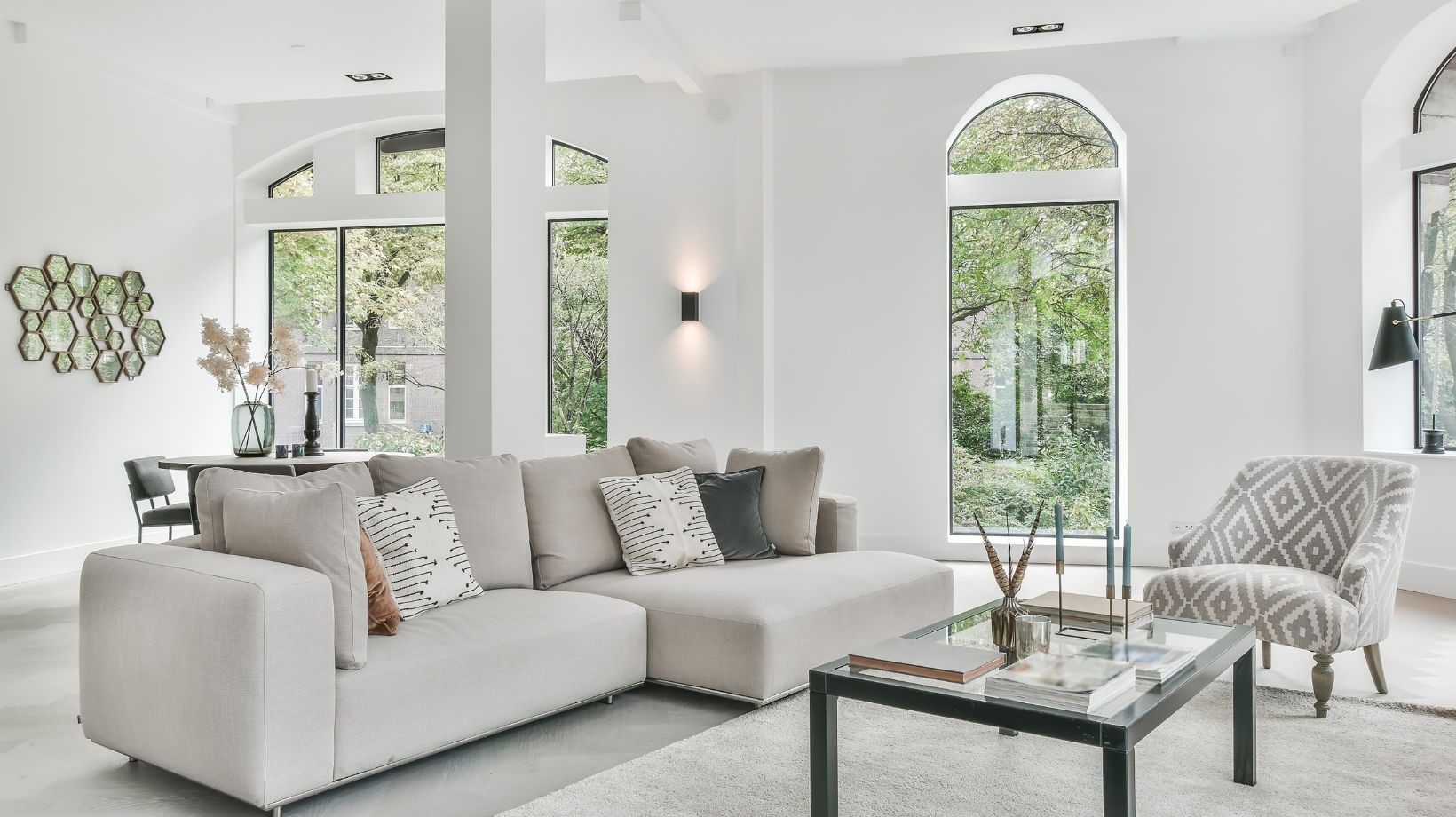
Consider a simple arrangement: a cream-and-amber lamp on a walnut table, an oatmeal sofa, one muted ochre cushion and a darker cushion that recalls the shade’s outlines. A pale textured rug gives the furniture a quiet setting. The connection is visible without repeating the lamp’s pattern across the room.
Leave some of the table surface empty and keep neighbouring accessories modest. Then assess the room from the entrance and from your usual seat. If the colours feel connected and the space remains comfortable to use, you have enough. Further additions can wait until there is a practical or personal reason for them.