
Storage is often treated as a finishing touch. A cabinet gets added when clutter builds up. A shelf appears after the fact. In my experience, that sequence is backwards. Storage decisions shape how a room feels long before they solve what needs to be hidden.
Modern living spaces, especially open-plan layouts, demand more intention. According to the National Association of Home Builders, more than 60 percent of new homes in the United States incorporate open-concept designs. When walls disappear, storage stops being a background utility and becomes part of the architecture of the room.
So the real question is not where a cabinet can fit. It is how storage should influence the space.
Start With Spatial Behavior, Not Furniture
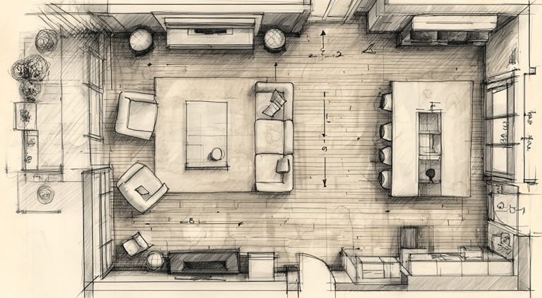
Before thinking about furniture types or finishes, observe how the room functions.
Where do people enter? Which pathways are used most often? Where do eyes naturally land when someone walks in?
Environmental psychology research suggests that people perceive spaces as more comfortable when sightlines remain clear across primary walking paths. Even a well-designed piece can make a room feel compressed if it interrupts those visual corridors.
Why does a space feel crowded even when it is not full?
Often, it is not about volume. It is about placement. When storage blocks movement patterns or sits in high-traffic zones, the brain registers friction. In my honest assessment, the most successful layouts begin with movement mapping, not furniture browsing.
Start by sketching the room. Mark entrances, windows, and focal points. Then draw the primary paths people take. Storage should support those paths, not compete with them.
Vertical vs Horizontal Storage Strategy
Modern interiors tend to emphasize horizontal lines. Lower profiles create longer visual planes, which can make a room feel calmer and more expansive. A study published in the Journal of Environmental Psychology found that horizontal visual cues are often associated with stability and restfulness, while strong vertical elements create a sense of energy.
So which approach works better?
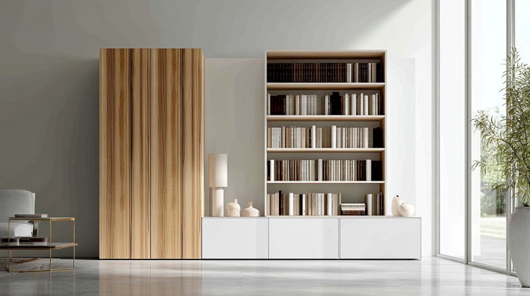
Vertical storage maximizes capacity. It is practical when square footage is limited and ceilings are generous. Tall cabinets use upward space efficiently and reduce footprint usage.
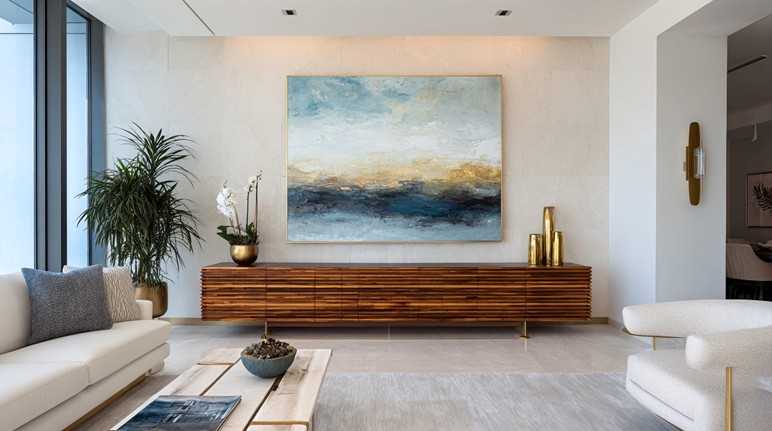
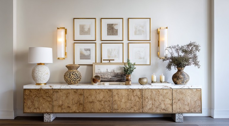
Horizontal storage anchors a room. It spreads visual weight across a wall instead of stacking it. In open living areas, designers frequently rely on elongated pieces, including modern credenza cabinets, to ground a seating arrangement without overwhelming vertical space.
The trade-off is clear. Vertical solutions offer density. Horizontal pieces offer balance.
Is the room struggling with clutter, or with proportion? If storage needs are modest but the wall feels empty, a low, extended piece often resolves the imbalance without introducing heaviness.
Ceiling height matters as well. In rooms under eight feet tall, large vertical cabinets can feel imposing. In spaces with ten-foot ceilings or more, they often feel appropriately scaled.
Planning Around Blank Walls Without Overwhelming Them
A long blank wall can feel intimidating. Many people either leave it empty or overcompensate with oversized furniture.
There is a proportion guideline designers often use. Furniture placed along a wall should occupy roughly two-thirds to three-quarters of that wall’s width to feel intentional. When a piece is too small, it floats. When it spans edge to edge, it can feel forced.
How wide should storage be compared to the wall?
Measure usable wall space, excluding door swings and architectural interruptions. Then calculate a target range that feels anchored yet breathable. Negative space provides visual relief and allows architectural features to stand out.
The American Institute of Architects frequently emphasizes that scale and proportion are foundational to residential comfort. Storage pieces are no exception. Width, height, and depth all influence whether a room feels resolved.
Depth also matters. A cabinet that extends too far into a walkway can subtly narrow a room. Residential design standards commonly recommend maintaining at least 36 inches for comfortable passage in primary circulation paths. Even when not legally required, those measurements reflect how people naturally move through space.
Common Storage Planning Mistakes in Modern Homes
Even thoughtfully designed rooms can suffer from recurring missteps.
Overscaling tall cabinets is one. A piece that looks impressive in a showroom may dominate a living room with lower ceilings.
Ignoring negative space is another. Filling every wall with storage eliminates visual breathing room and increases perceived density.
Treating storage as an afterthought creates imbalance. Finalizing seating, lighting, and rugs first often forces cabinets into compromise placements.
Pushing all storage against walls is another common habit. In open-plan homes, storage can also act as subtle zoning, helping define living and dining areas without building physical barriers.
Choosing based solely on trend rather than proportion creates long-term dissatisfaction. A piece may be popular, but if it does not match the scale of the room, it will never feel settled.
If a piece feels too heavy, the issue is usually proportion, not style.
A Practical Framework for Storage Layout Decisions
When planning storage in a modern living space, use a structured evaluation process.
First, measure usable wall width and ceiling height. Record precise numbers.
Second, identify focal lines. Is the room centered around a fireplace, a window wall, or a media area? Storage should reinforce that focus.
Third, define the primary purpose. Are you storing media equipment, tableware, documents, or simply reducing surface clutter? Capacity requirements change dimensions.
Fourth, evaluate visual weight. Wider and lower pieces distribute mass differently than narrow, tall ones. Stand at the main entry point and consider how the piece will read from that angle.
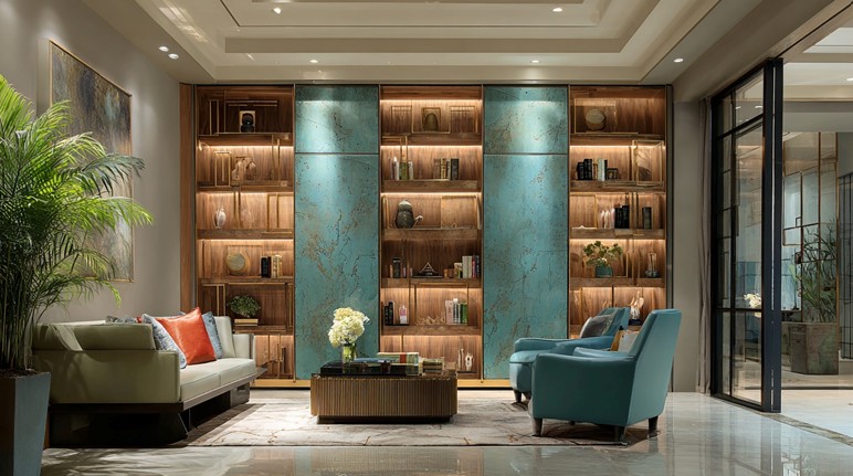
Fifth, balance closed and open storage. Closed fronts reduce visual noise. Open shelving introduces display opportunities but can add busyness if overused.
Sixth, pressure-test proportions. Use painter’s tape on the wall or cardboard mockups on the floor to simulate size. This step alone prevents costly mistakes.
This framework shifts storage from reactive purchasing to intentional planning.
Trade-Offs to Consider Before Committing to a Layout
Every storage decision involves compromise.
Low-profile pieces may enhance openness but limit maximum capacity. Taller cabinets increase storage but may interrupt sightlines.
Symmetrical layouts create order, yet they can restrict flexibility when furniture arrangements change. Asymmetry introduces adaptability but requires careful balance to avoid visual clutter.
Accessibility is another factor. Deep cabinets hide clutter effectively, yet items stored at the back may become forgotten. Shallow storage keeps items within reach but may reduce overall volume.
Is more storage always better?
In my personal judgment, no. Excess storage often invites excess accumulation. Research from UCLA’s Center on Everyday Lives of Families has documented how higher household storage capacity often correlates with increased household inventory, not necessarily improved organization.
Modern living spaces reward restraint. Thoughtful placement, measured proportions, and awareness of movement patterns matter more than sheer volume.
When storage planning begins with spatial behavior and ends with proportional balance, the room works harder without feeling heavier.