In the world of design, capturing attention is essential. One principle stands out for its ability to create visual intrigue: contrast. By employing noticeably different elements, contrast draws the eye and enhances the overall aesthetic. Whether in graphic design, interior decoration, or fashion, understanding how to use contrast effectively can transform a mundane composition into something truly captivating.
Designers leverage contrast to highlight key features, evoke emotions, and guide viewers through their work. By juxtaposing colors, shapes, and textures, they create a dynamic interplay that keeps the audience engaged. This article delves into the significance of contrast in design, exploring how it not only adds interest but also communicates meaning and enhances functionality.
Table of Contents
ToggleWhat Principle of Design Uses Noticeably Different Elements to Create Interest?
Design principles serve as guidelines that shape visual compositions, ensuring coherence and appeal. One fundamental principle is contrast. Contrast involves using noticeably different elements to create visual interest, drawing attention to specific areas within a design. This principle enhances aesthetics and functionality across various design fields.
Importance of Contrast
Contrast highlights key features by juxtaposing colors, shapes, and textures. For example, using light text on a dark background ensures readability while making the text stand out. Designers often employ contrasting elements to evoke emotions. Bold colors can provoke excitement, while softer tones may induce calmness.
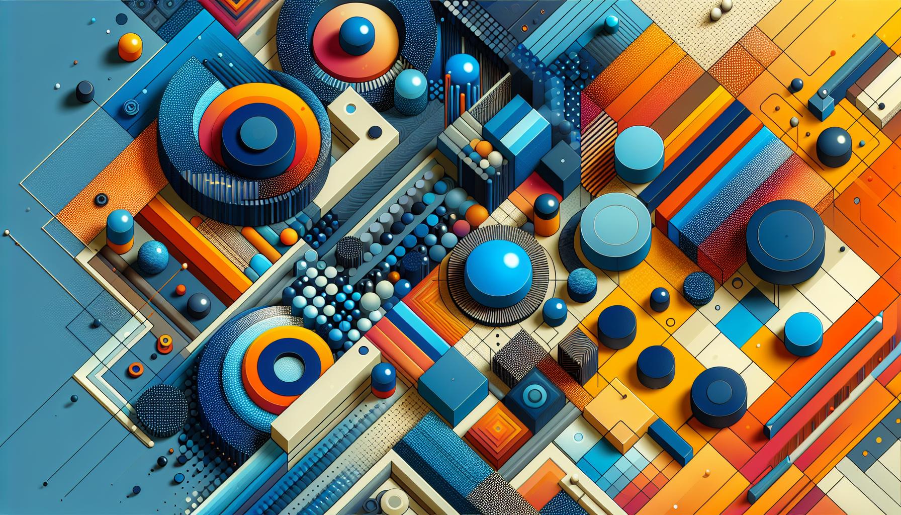
- Color Contrast: Utilizing opposite colors on the color wheel, such as blue and orange, creates vibrant visuals.
- Shape Contrast: Mixing geometric shapes with organic shapes introduces dynamism, capturing viewer attention.
- Texture Contrast: Combining smooth and rough textures can create depth and interest in a design.
- Size Contrast: Varying sizes of elements, like placing a large image beside a small text block, emphasizes important information.
Each type of contrast plays a significant role in enhancing the overall design. By understanding and applying these contrasting elements, designers elevate the visual appeal and ensure effective communication through their work.
Importance of Contrast in Design
Contrast significantly enhances the effectiveness of design by creating visual interest and drawing attention. By implementing various contrasting elements, designers effectively capture the viewer’s focus and convey important messages.
Definition of Contrast
Contrast refers to the discernible differences between elements within a design. These differences can manifest through color, size, shape, texture, and even direction. For example, contrasting colors, such as blue against orange, intensify visual engagement. Clear separations between large and small elements provide emphasis, while differing textures can create a tactile experience. Designers utilize contrast as a tool to guide the eye and establish hierarchy within their work.
Role of Contrast in Visual Interest
Contrast plays a vital role in enhancing visual intrigue. It engages viewers by creating a dynamic interplay between elements. Designers might juxtapose soft curves with sharp angles to establish tension and excitement. Using complementary colors energizes compositions, while contrasting lightness with darkness generates mood and depth. By applying contrast thoughtfully, designers foster an atmosphere that captivates audiences, inviting them to explore the visual narrative.
Elements of Design that Contribute to Contrast
Contrast emerges from the intentional use of different elements that enhance visual interest. Key design elements that significantly contribute to contrast include color, shape, texture, and size.
Color
Color contrast involves using opposing colors on the color wheel, such as complementary colors like blue and orange. This method captures attention and guides focus to critical components. Bright colors against muted tones also amplify visibility. For instance, white typography on a black background enhances readability while creating striking visual effects.
Shape
Shape contrast uses varying forms to create interest and dynamic visual compositions. Designers often blend geometric shapes with organic ones to establish complexity. For example, pairing sharp triangles with soft, rounded shapes can evoke tension and excitement, guiding the viewer’s eye across the design. Diverse shapes can also indicate hierarchy, leading viewers through content based on visual cues.
Texture
Texture contrast enriches the tactile quality of designs. Smooth elements juxtaposed with rough textures add depth and intrigue. For instance, integrating glossy materials with matte finishes can create visual drama, enhancing emotional impact. Variations in texture also emphasize important elements and contribute to an overall immersive experience.
Size
Size contrasts play a crucial role in establishing visual hierarchy. Large elements draw attention, while smaller components support and balance the design. For example, a large headline combined with smaller body text creates a clear focal point. This approach not only organizes information but also enhances comprehension by guiding the viewer’s focus strategically.
Applications of Contrast in Various Mediums
Contrast plays a pivotal role in various design mediums, enhancing aesthetics and guiding viewer engagement. It creates distinct visual interest by combining different elements effectively.
Graphic Design
In graphic design, contrast primarily uses color, size, and typography to create striking visuals. High-contrast color schemes, such as black and yellow, command attention and improve legibility. Designers often mix bold fonts with softer ones to emphasize specific messages, making content more impactful. Incorporating contrasting images, like a vibrant photograph against a muted background, enhances the visual narrative and attracts the viewer’s eye.
Interior Design
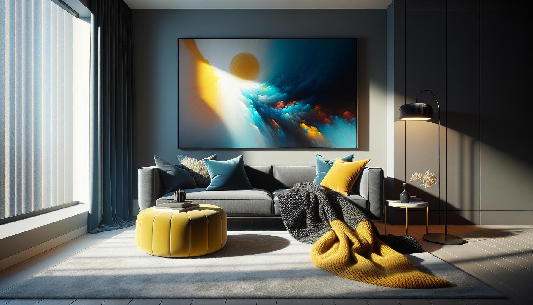
Interior design employs contrast through color palettes, textures, and furnishings. Designers often use dark and light hues in rooms to create depth and warmth. Pairing rough textures with smooth surfaces adds a tactile element, enhancing the overall sensory experience. For example, combining a plush velvet sofa with angular metal furniture strikes a balance between comfort and modernity, making the space visually dynamic and inviting.
Fashion Design
In fashion design, contrast influences patterns, colors, and silhouettes. Designers frequently juxtapose dramatic prints with solid colors to create standout pieces that draw attention. Mixing different fabric textures, like silk and denim, creates visual intrigue and adds depth to outfits. Additionally, contrasting silhouettes—such as a fitted top with a flowing skirt—can enhance the wearer’s shape while creating a noticeable fashion statement.
Contrast in Design
Contrast stands as a vital principle of design that breathes life into visual compositions. By skillfully incorporating different elements, designers can create engaging and dynamic experiences that draw viewers in. This principle not only enhances aesthetic appeal but also serves a functional purpose in guiding focus and improving comprehension.
Whether through color, shape, texture, or size, the thoughtful application of contrast transforms ordinary designs into captivating narratives. Embracing this principle allows designers to evoke emotions and establish a strong visual hierarchy, ultimately enriching the viewer’s experience across various design fields.


