Proportion plays a crucial role in the principles of design, influencing how elements interact within a space. It refers to the relationship between sizes and shapes, helping to create balance and harmony in visual compositions. Understanding proportion allows designers to guide the viewer’s eye and evoke specific emotions through their work.
In various fields such as architecture, graphic design, and interior design, proportion can make or break a project. By mastering this principle, designers can ensure that their creations resonate with audiences, delivering both aesthetic appeal and functional effectiveness. Whether it’s the height of a building or the layout of a webpage, proportion is a fundamental concept that shapes the way people perceive design.
Table of Contents
ToggleWhat Is Proportion in Principles of Design
Proportion plays a crucial role in design, influencing balance and harmony among various elements. Designers use proportional relationships to create visual impact. Understanding proportion involves grasping how sizes and shapes interact within a given space.
- Scale: Scale refers to the size of an object in relation to its surroundings. It affects how viewers perceive an element based on its size compared to other elements or the human body.
- Hierarchy: Hierarchy establishes a focal point through size variation. Larger elements attract more attention, guiding the viewer’s eye through a design.
- Rhythm: Rhythm arises from repeated proportions, creating a sense of movement and flow. Consistent proportions in patterns or layouts enhance visual rhythm, leading to a more engaging experience.
- Unity: Unity relates to how proportional elements work together within a composition. Harmonious proportions contribute to a cohesive appearance, ensuring that all elements feel connected.
- Contrast: Contrast arises from varying proportions of elements, adding interest to a design. Strategic use of proportion can highlight differences and create focal areas.
Understanding these aspects enhances a designer’s ability to manipulate proportion effectively, leading to more successful outcomes in fields such as architecture, graphic design, and interior design. Quality application of proportion significantly improves both aesthetic appeal and functionality in any project.
The Importance of Proportion
Proportion plays a crucial role in design, significantly influencing both aesthetic appeal and functionality. Designers must understand how to effectively utilize proportion to achieve harmony within their work.
Aesthetic Appeal
A well-considered proportion enhances the visual allure of a design. Proportion determines how elements interact, ensuring a balanced composition. For instance, the golden ratio, a famous proportion often found in nature, creates pleasing visuals. In graphic design, proportion influences typography, spacing, and layout. In architecture, it affects the relationship between buildings and their environment. Mastering proportion elevates aesthetics, resulting in striking and memorable designs.
Functionality and Harmony
Proportion directly impacts functionality by guiding the arrangement of elements for optimal use. A harmonious proportion makes spaces more navigable and elements more intuitive. In interior design, for example, furniture size in relation to room dimensions ensures comfort and accessibility. In product design, proportion affects usability, ergonomic comfort, and appeal. By aligning proportion with function, designers create harmonious environments that fulfill practical needs while remaining visually engaging.
Types of Proportion
Proportion in design encompasses various methods for achieving balance and harmony among elements. Two prominent types of proportion include the golden ratio and the rule of thirds.
Golden Ratio
The golden ratio, approximately 1:1.618, creates visually appealing compositions. This mathematical ratio appears in nature and art, guiding designers to establish harmony and balance. In practice, the golden ratio divides a design into sections that facilitate aesthetic flow. For example, many renowned artworks and architectural marvels, like the Parthenon, utilize the golden ratio for their proportions. Implementing this ratio in layouts, typography, and images leads to compositions that resonate with viewers and enhance visual appeal.
Rule of Thirds
The rule of thirds segments a design into a 3×3 grid, placing essential elements along the grid lines or at their intersections. This approach fosters balance and draws the viewer’s attention naturally. For instance, in photography, placing the horizon along the top or bottom grid line enhances depth. In graphic design, positioning text or images at intersection points creates a more dynamic visual experience. The rule of thirds simplifies designs, ensuring that focal points engage viewers effectively while maintaining proportionate relationships among elements.
How to Use Proportion in Design
Proportion serves as a fundamental aspect in design, guiding the spatial relationships between elements. Effectively utilizing proportion enhances both aesthetic appeal and functionality, making design projects more impactful.
Balancing Elements
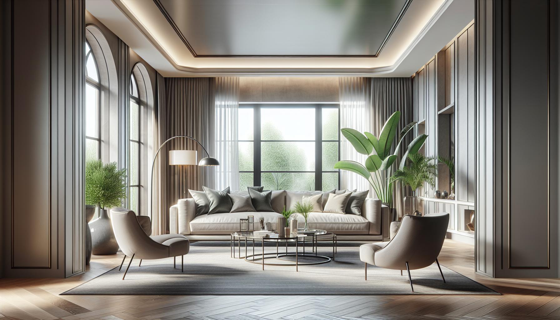
Balancing elements involves arranging them in a way that creates visual stability. Designers can achieve this by considering the size and weight of each element in relation to others. For instance, a large sofa can be balanced with several smaller accent chairs, creating harmony within the space.
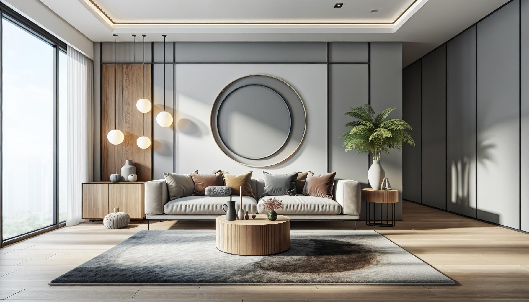
Symmetrical proportions promote a sense of order. Placing the same objects on either side of a central axis contributes to visual equilibrium. On the contrary, asymmetrical proportion allows for more dynamic compositions. An oversized piece of art may harmonize with smaller furniture, drawing attention while maintaining balance. Recognizing the relationship between proportions ensures that designs feel cohesive and unified.
Creating Visual Interest
Creating visual interest hinges on a thoughtful application of proportion. Varying the dimensions of elements can evoke curiosity and engagement. For example, contrasting scale relationships, such as pairing a tall vase with a low coffee table, captures attention and directs the viewer’s gaze.
Utilizing proportion creates rhythm within a design, guiding the eye through a space. Repetitive use of certain sizes can produce a sense of flow, while abrupt changes in proportion introduce excitement. Designers often apply the golden ratio to structure elements in a way that naturally attracts the eye and maintains intrigue.
In graphic design, the rule of thirds enhances visual interest by distributing elements across a grid. This technique allows focal points to emerge organically and facilitates a balanced, engaging layout. Combining different proportions intelligently leads to designs that not only appeal visually but also provide a sense of narrative and movement.
Common Mistakes to Avoid
Designers often encounter pitfalls when applying proportion, leading to imbalances and ineffective visual communication. Identifying and avoiding these common mistakes can enhance the overall effectiveness of a design.
- Ignoring Scale Relationships: Not considering how different elements relate in size creates disconnection within a design. For example, placing oversized furniture in a small room diminishes both comfort and functionality.
- Overemphasizing Symmetry: Relying solely on symmetrical designs can lead to a lack of visual interest. Incorporating asymmetrical proportions adds dynamism and intrigue, engaging viewers more effectively.
- Neglecting Context: Failing to consider the surrounding environment affects proportion. For instance, designs that don’t respond to their context may appear out of place, diminishing overall aesthetic appeal.
- Misapplying the Rule of Thirds: Incorrectly placing focal points according to the rule of thirds can disrupt visual flow. Focal elements should align with grid lines or intersections to create balance and draw attention.
- Disregarding Hierarchy: Ignoring the viewer’s eye movement results in confusion. Establishing a clear hierarchy ensures that the most important elements receive attention first, leading to better communication.
- Underestimating Negative Space: Overcrowding a design neglects the vital role of negative space. Adequate spacing between elements enhances clarity, enabling the viewer to navigate the composition effortlessly.
- Failing to Test Proportions: Not evaluating proportions through sketches or digital tools hinders the design process. Prototyping allows for adjustments, ensuring optimal relationships between elements.
By recognizing these mistakes, designers can strengthen their approach to proportion, leading to more cohesive and engaging designs that resonate with audiences.
Understanding Proportion in Principles of Design
Proportion is a vital aspect of design that shapes the visual and functional qualities of any project. By understanding and applying principles like scale and hierarchy, designers can create spaces that not only look appealing but also serve their intended purpose effectively. Mastery of proportion enables the seamless integration of elements, fostering harmony and balance that enhances viewer engagement.
Avoiding common pitfalls ensures that designs communicate effectively and resonate with audiences. Ultimately, a keen grasp of proportion can transform ordinary designs into extraordinary experiences, making it an essential skill for anyone in the field.


