You’ve probably noticed how different colors can affect your mood. But have you considered how this might influence an event you’re planning? The colors you choose for your event’s interior design, from the walls to the table settings, can greatly impact your attendees’ experience. Understanding the psychology behind colors can give you a strategic edge, enabling you to create the perfect atmosphere for your event. But what colors should you choose and why? Let’s explore how color psychology can elevate your event planning skills.
Understanding Color Psychology Basics
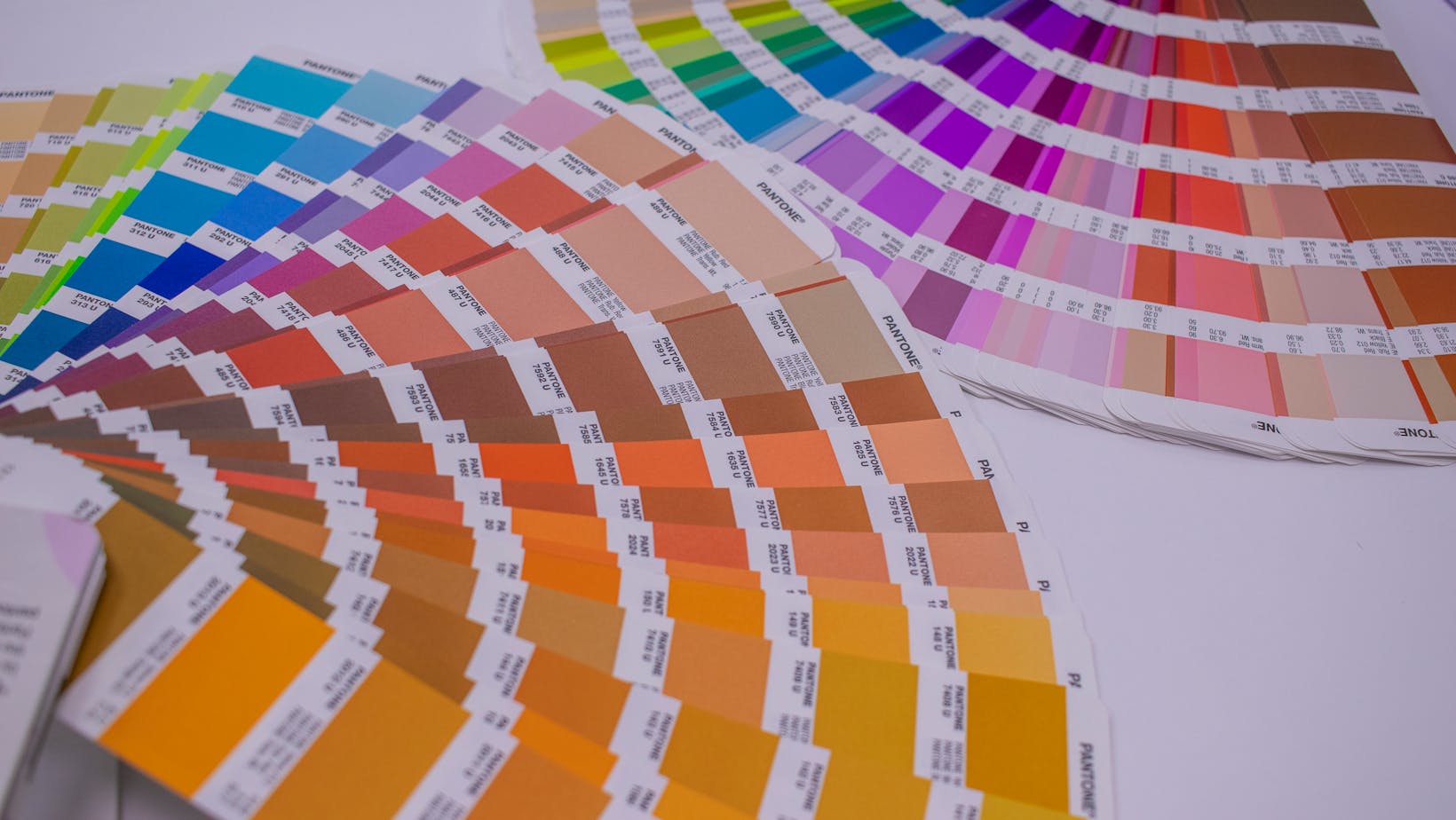
Before delving into the impact of color psychology in event design, it’s essential for you to grasp the basics of this fascinating field, where every hue can evoke a unique emotional response. Imagine walking into a room painted in bold red or calming blue. Your immediate feelings, impressions, and reactions aren’t accidental. They’re dictated by color psychology, a study focusing on how color affects our mood and behavior.
Each color has a psychological value. Think about how you feel when you wear your favorite outfit, the comfort of a soothing green landscape, or the excitement evoked by vibrant festival lights. Those feelings aren’t random, but the result of centuries of psychological research and cultural associations.
Red, for instance, is often associated with excitement, passion, danger, or even anger. On the other hand, blue tends to invoke feelings of calmness, stability, and trust. Green, commonly linked to nature, brings feelings of peace and renewal. From fiery oranges to delicate pinks, every shade has the power to influence our emotions, making color psychology a key player in setting the right mood for any event.
Color Choices in Event Design
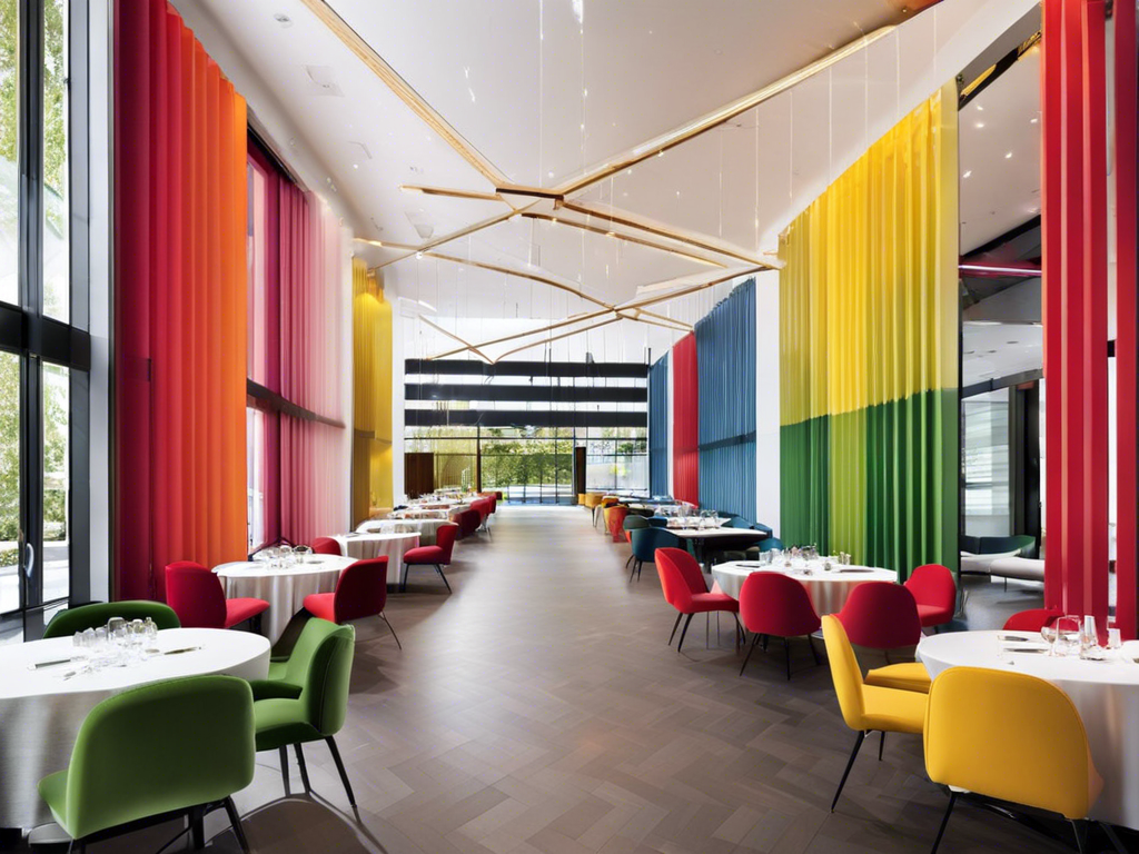
When planning an event, your choice of colors plays a pivotal role in setting the atmosphere, engaging attendees, and communicating your vision effectively. Whether you’re organizing a corporate seminar, a wedding reception, or a charity fundraiser, color selection can make or break the success of the event.
Consider these aspects when making your color choices:
- Event Type: Formal events might require muted, elegant shades, while casual gatherings can benefit from bright, lively colors.
- Audience: Think about who’s attending. Kids’ events are often vibrant and colorful, while professional events may favor a more subdued palette.
- Season: The time of year can greatly influence color choice. Autumnal colors for a fall event or pastel shades for a spring affair can beautifully reflect the season.
- Theme: If your event has a theme, color should enhance and highlight this. A nautical theme might use blues and whites, while a vintage theme could feature sepia tones.
The Impact of Color on Emotions
Beyond the aesthetic appeal, it’s worth noting how colors can tap into your attendees’ emotions, shaping their overall event experience. Colors can act as nonverbal communication, subtly influencing moods and reactions. Red, for instance, frequently stimulates feelings of excitement and passion, making it ideal for dynamic, high-energy events. Alternatively, blue tends to evoke calmness and trust, which is perfect for professional seminars or networking affairs.
Incorporating the right colors into your event design isn’t just about the walls or decorations. Consider how table settings, lighting, and even staff uniforms can influence attendees’ emotional responses. Imagine a charity gala bathed in soft, warm hues, fostering a sense of generosity, or a product launch with vibrant, bold colors, instilling a sense of innovation and excitement.
It’s essential to understand your audience and the emotional journey you want them to experience. Whether you aim to inspire, energize, or soothe, purposeful color selection can greatly enhance the emotional impact of your event. So, explore the psychology of color and use it to create unforgettable, emotionally resonant experiences for your attendees.
Case Studies: Successful Color Use
Let’s explore the world of successful event planning and management services in Dubai by examining some case studies where the strategic use of color greatly enhanced the attendee experience. You’ll find that color isn’t just a visual element; it’s a psychological tool that can shape emotions, guide behavior, and create memorable experiences.
Consider these four examples:
- The Blue Room Event: Designers used different shades of blue to create a calming atmosphere for a corporate wellness retreat. The serene ambiance encouraged relaxation and open conversation among attendees.
- The Red Gala: A charity event utilized red decor to evoke feelings of passion and urgency, intensifying the appeal for donations and stimulating generosity.
- The Green Conference: For an environmental summit, green hues were employed to reinforce the theme of sustainability, fostering a sense of connection with nature.
- The Yellow Workshop: Bright yellow was used in a creativity workshop to stimulate imagination and inspire innovative thoughts among participants.
These case studies illustrate the power of color in event design. It’s not just about making a space look pleasing; it’s about creating an environment that aligns with the event’s purpose and influences attendees’ emotions and actions. By understanding color psychology, you can make strategic choices that enhance the attendee experience.
Tips for Implementing Color Psychology
Explore the art of utilizing color psychology in your event design with these insightful tips that can transform your attendees’ experience.
First, understand your audience. Different colors elicit varied emotional responses based on age, culture, and personal preference. Research your demographic thoroughly to guarantee your color choices resonate with them.
Next, think about the mood you want to set. If you’re aiming for a calming environment, go for blues and greens. For an energetic vibe, opt for oranges and reds. Remember, balance is key. Don’t overload your space with too many colors or one dominating shade.
Lastly, consider lighting. The way colors appear can significantly alter under different lighting conditions. Test your color choices under the lighting conditions of your event to avoid any unpleasant surprises.
Incorporating color psychology isn’t just about picking pretty shades. It’s a strategic tool that can enhance your event, affect attendees moods, and create memorable experiences. So, embrace the power of color, and let it be a game changer in your event design. Remember, your aim is to captivate your audience, and color is one of the most effective ways to do just that.
Conclusion
So, don’t overlook the power of color in your next event design.
It’s the silent trump card, stirring emotions and guiding interactions subtly.
Like the artist mixing hues on a palette, blend colors tactfully to create the desired ambiance.
Remember, the right color can turn an ordinary event into a masterpiece, leaving your attendees with an unforgettable splash of brilliance.
Master the art of color psychology, and watch your event experiences transform.