
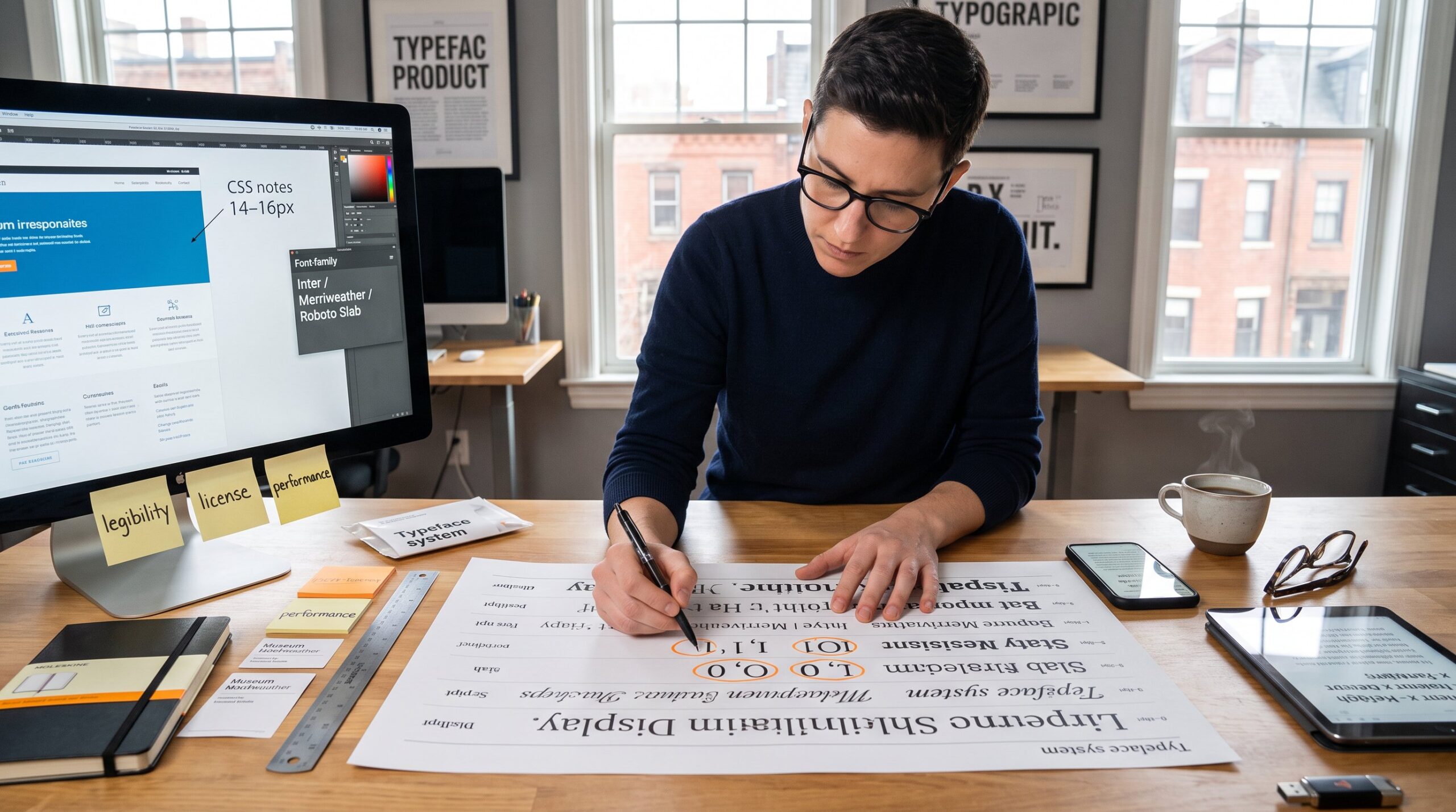
How to choose typography for a design project starts with clear goals: medium, audience, and tone. Designers who define those three items first avoid costly redesigns and slow approvals. This guide gives direct steps for deciding between serif, sans‑serif, script, slab, and display faces: for building a limited type system: and for checking legibility, licensing, and performance across web, print, and mobile.
Table of Contents
ToggleKey Takeaways
- Start typography selection by defining clear project goals, audience characteristics, and tone to ensure relevant and effective design choices.
- Understand type anatomy and classification to assess legibility and suitability; consider factors like x-height, stroke contrast, and aperture for your medium and content.
- Match font classes—serif, sans-serif, script, slab, and display—to their ideal use cases to optimize readability and brand tone in your design project.
- Limit font families and styles to a small, manageable system (1–3 typefaces, 4–6 styles) to maintain consistency and ease technical implementation.
- Establish typographic hierarchy and contrast through size, weight, and spacing to create clear and engaging visual communication.
- Perform thorough legibility, accessibility, and technical checks on all target devices and media to ensure your typography supports usability and compliance.
Define Project Goals, Audience, And Tone
Answer: Begin by listing the project’s purpose, the audience profile, and the intended tone. A clear brief reduces guesswork.
For example, a subscription newsletter aimed at busy professionals needs compact, highly legible text at 14–16px on mobile: a museum exhibit label requires durable, high‑contrast serif at larger sizes. The designer should record medium (web, app, print, signage), content type (long articles, short cards, microcopy), and brand constraints (existing logos or color rules).
They must also map audience details: age ranges, reading skill, language needs (accented glyphs, right‑to‑left support), and cultural expectations. Tone ties to type personality: choose serif for formal or traditional personalities, sans‑serif for modern and digital first brands, script for elegant accents, and slab for sturdy, industrial feeling.
Practical note: if the project needs quick, broad guidance, consult a compact resource like the site’s overview of design resources for templates and examples. The designer might link to a short resource such as design inspiration hub to align visual direction with typographic choices.
Understand Type Anatomy And Classification
Answer: Know the core anatomy, x‑height, ascenders, descenders, stroke contrast, aperture, and spacing, because these properties directly affect legibility and tone.
X‑height controls perceived size: a larger x‑height reads bigger at the same point size, helping small‑screen legibility. Ascenders and descenders influence line spacing needs. High contrast between thick and thin strokes can look elegant but fail on low‑resolution displays. Aperture (the open space inside letters like ‘e’ or ‘a’) affects character recognition at small sizes.
Classification helps predict function. Text faces, often low contrast with open apertures, work for paragraphs. Display faces, with tighter spacing and high contrast, serve large headlines only. Within sans‑serifs, humanist designs feel warm, geometric feel clean and modern, and grotesque strike a balance.
Practical check: view candidate fonts at your smallest intended size on target devices. The designer should compare glyphs for ambiguous pairs (I, l, 1: O, 0) to avoid confusion in forms and codes. For deeper reading on tactile visual elements, cross‑reference texture and emphasis articles like the piece on texture in design.
Serif, Sans-Serif, Script, Slab, And Display — Practical Uses
Answer: Match type class to use case, each class has predictable strengths and failures.
Serif: Best for long print reading and traditional brands. Example: a 300‑page report used Garamond for comfortable long reads: it reduced reader fatigue in usability tests. Serif letterforms anchor trust in editorial or legal contexts.
Sans‑serif: Best for interfaces and on‑screen body text. Google’s Roboto and Inter show how open apertures and high x‑height help at small sizes. Sans faces also scale well across weight families.
Script: Use sparingly for logos or invitations. It conveys personality but fails at small sizes and in mixed language settings. Avoid script for form labels or error messages.
Slab: Use for headlines and branding that needs bold, stable presence. Slab serifs read as assertive in packaging or posters.
Display: Reserve for large headings and decorative moments only. Display fonts often lack robust small‑size legibility or full glyph sets.
Warning: never force a display or script face into body text: the visual friction costs comprehension and credibility. When choosing, test each candidate in the exact content scenario, menu, caption, or article, rather than relying on specimen pages.
Pairing Fonts, Establishing Hierarchy, And Creating Contrast
Answer: Use 1–3 typefaces, assign clear roles, and create contrast via size, weight, color, and spacing.
Start with a reliable text face for paragraphs, then add a contrasting display or headline face if needed. Contrast should be meaningful: pair a neutral humanist sans for body with a geometric headline to create rhythm, or match a transitional serif body with a slab headline for assertive editorial layouts. The pillar guide covers this in more detail for anyone who wants to go deeper.
Hierarchy rules: set body at a base size (web typically 16px), then apply scale steps, 18–22px for subheads, 28–40px for H1, keeping line length around 45–75 characters. Use weight (Regular, Medium, Bold), letter‑spacing, and color to signal importance. Limit stylistic variants: pick Regular, Italic, and Bold as the core set and avoid adding multiple decorative styles.
Practical pairing exercise: pick a candidate body type and create three heading contrasts. Print or simulate on device, then measure the perceived loudness of each heading by asking three readers which draws attention first. That quick test highlights overbearing headline types before launch. Also, tie typographic hierarchy to layout decisions found in guides like the color palette guide when spacing and contrast need coordination.
Building A Typeface System: Weights, Styles, And Family Limits
Answer: Build a constrained family system: pick a primary family with multiple weights and an optional secondary for accents.
A practical rule: limit the system to two families and four to six active styles (e.g., Regular, Medium, Bold, Italic, and Bold Italic). This keeps CSS and layout predictable and reduces page weight. Choose families that include a wide weight range and italics so the design can scale without adding new fonts.
Define explicit usage rules in a one‑page spec: which weight for H1–H6, which for captions, and allowed letter‑spacing. Include fallback fonts for web stacks to preserve tone if the chosen webfont fails to load. Also log licensed usage: desktop versus webfont permissions and the number of seats.
Honest lesson: a team once added three decorative headline fonts to win stakeholder votes: the result was inconsistent pages and a 40% increase in CSS overrides. The corrected approach was to roll back to a two‑family system and document the rules for each element. For quick learning resources on where to start, see curated free learning options like the design learning list.
Readability, Accessibility, And Technical Considerations (Web, Print, Mobile)
Answer: Verify legibility at the smallest sizes and ensure accessibility compliance before finalizing fonts.
Legibility checklist: test smallest body size on actual devices, confirm color contrast meets 4.5:1 for body text, set line height to roughly 1.4–1.6, and keep optimal line length 45–75 characters. Check ambiguous characters and tabular numerals where financial or technical content appears.
Technical checks: examine webfont file size and loading behavior: use font subsetting to reduce weight. Confirm glyph coverage for all required languages and diacritics. Review licensing to avoid sudden takedowns or unexpected fees. For print, confirm ink trapping and stroke contrast, thin strokes may break when printed small on absorbent paper.
Accessibility note: screen readers prefer simple, semantic HTML and predictable visual ordering: choose fonts with clear distinctions between letters, and don’t rely solely on weight or color to convey meaning. When working on broader layout and emphasis, coordinate type choices with visual texture and emphasis techniques explained in related documentation, such as the article on emphasis techniques.
Conclusion
Answer: Choose type by aligning project goals, audience needs, and tone, then constrain choices into a small, documented system and validate on real devices. A clear brief and early legibility checks prevent rework and preserve brand clarity. For practical resources and templates to apply these rules, designers can explore the site’s central resource collection in the creative hub and related how‑to articles.