Choosing furniture is the part of a redesign that usually feels most exciting and most straightforward. You know what you like. You have a sense of the direction. The problem, which tends to become apparent only once the pieces arrive, is that knowing what you like and knowing what will work in this specific room are two different things.
The most common furniture regrets — pieces that felt right in the showroom or online and landed wrong in the room — almost always trace back to the same point: a decision made before the room was fully understood.
Table of Contents
ToggleThe room before the furniture
What is this room actually for? Not in a general sense. In a specific, daily-life sense.
A living room used mainly for family evenings with children needs different things from one used primarily for quiet reading. A dining room that hosts gatherings regularly is a different brief from one used mostly for informal weekday meals. A bedroom that doubles as a working space for several hours a day has storage and circulation requirements that a sleep-only bedroom does not.
Starting from this question — rather than from a mood board or a shortlist of pieces that look appealing — changes which furniture gets chosen, and in what order. The room’s use should be generating the furniture list, not the furniture list generating an idea about how the room might be used.
What measurements actually tell you, and what they don’t
A dimension tells you whether something will physically fit. It does not tell you how the room will feel once it does.
A sofa can be the correct length for a wall and still leave insufficient space for comfortable circulation past it. A wardrobe can fit between two walls without its door having enough clearance to open fully. A dining table can sit within the available floor area without leaving enough room for chairs to be pulled back and sat in properly — the footprint that matters is the chair pulled out, not the table.
Because larger furniture decisions are often easier to assess in context than in isolation, the wider interiors and furnishings industry increasingly relies on detailed visual planning tools, including specialised 3d furniture rendering services usa providers use to present pieces with realistic scale, materials, and room setting. For homeowners, a scaled floor plan with furniture footprints drawn in — even a rough one — does something similar. The room that looked spacious enough on paper often has less usable space than expected once the largest pieces are represented at their actual size.
Ceiling height is worth including in these calculations. A storage unit that would feel proportionate in a room with generous ceiling height can compress a standard-height room in a way that is hard to predict from the product page alone.
Movement
A room can look finished and be uncomfortable to be inside. The coffee table placed exactly where the path between the sofa and the door runs. The wardrobe whose door swings into the space needed to get out of bed. The dining chairs that cannot be pushed back without lifting them first.
These are the frictions that accumulate into a room feeling vaguely wrong without any one obvious cause.
A general benchmark for walking space around the main pieces is 75 to 90 centimetres. Around dining tables, what needs to be clear is the space behind a chair with someone sitting in it — which is considerably more than the space behind the chair when it is pushed in. Checking this at the planning stage costs nothing.
Sequence
Redesigns that feel coherent tend to have been planned in a particular order, even if the order was not explicit at the time.
The anchor piece first. In a living room this is usually the sofa. In a dining room the table. In a bedroom the bed. This is the piece with the most visual weight and the largest footprint, and every other decision in the room relates to it in some way.
Secondary pieces follow: the chairs and sideboards and media units and wardrobes that support the main piece and fill the room out. Then the smaller things. The styling layers — rugs, lighting, textiles, objects — come last, chosen in response to everything that is already there.
Going backwards through this sequence, which happens easily when inspiration and aesthetics are driving the process, means each new major decision is already constrained by whatever came before it. A room assembled this way often shows it.
The room itself
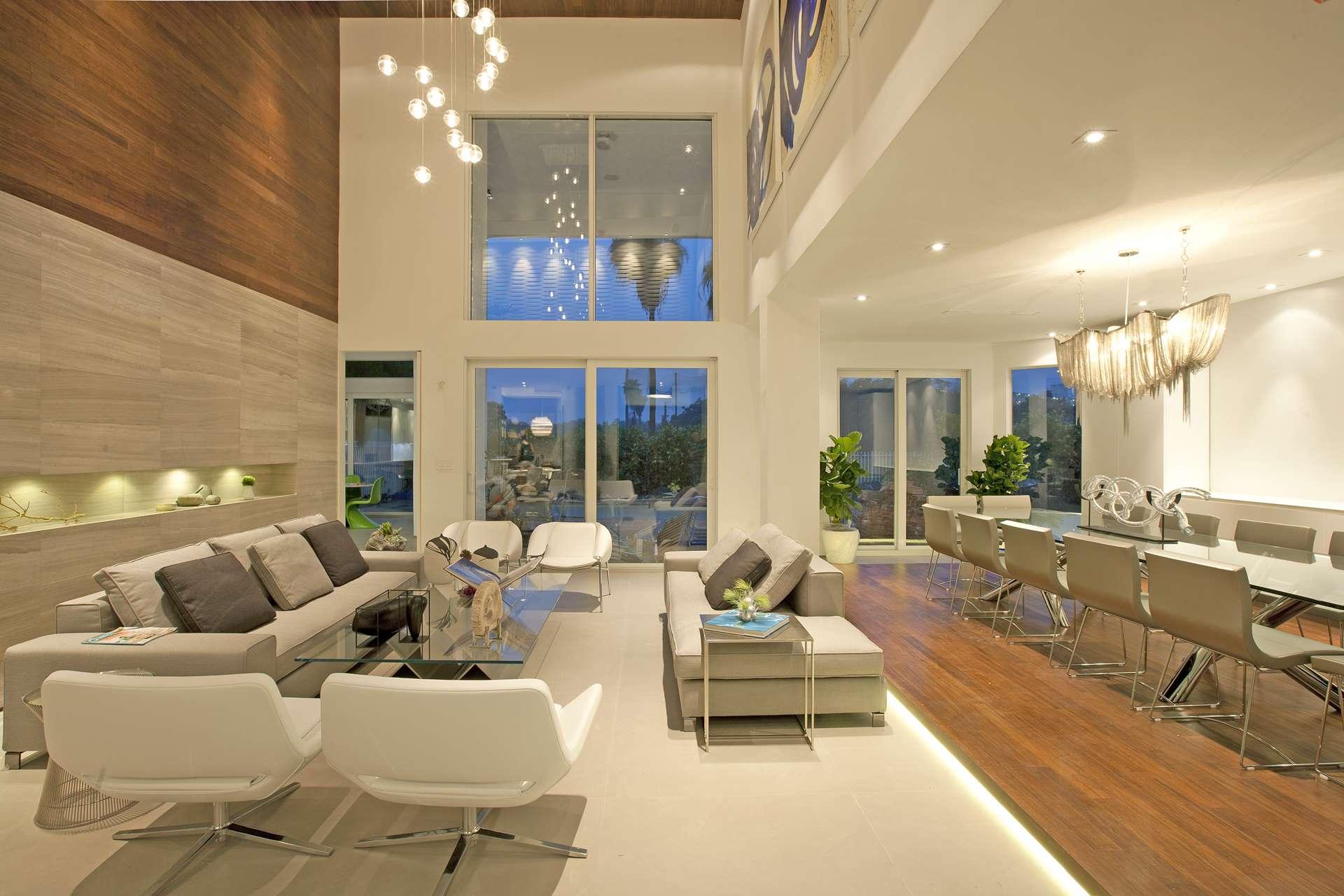
A Victorian terrace and a contemporary apartment have different spatial characters, and furniture that feels right in one can read as slightly wrong in the other.
Period features, original windows, fireplaces, exposed structural elements — these are not just decorative. They are spatial anchors that already give the room a direction. The furniture does not need to match them stylistically, but it works better when it acknowledges them. An open-plan kitchen and living area needs furniture to establish where one zone ends and another begins. A bedroom in a converted loft has sloping ceilings that constrain where certain pieces can go.
Working around these realities, rather than around an ideal scheme designed for an abstract room, tends to produce results that feel like they belong where they are.
Finishes
When furniture comes from multiple sources — which it almost always does — the risk is a room where nothing is wrong with any individual piece and something is slightly off about the whole thing.
Wood tones that sit in different parts of the warm-to-cool range. Metal finishes that are close but not identical. Upholstery that makes one area of the room feel visually heavier than another. None of this is necessarily a problem. But it should be a decision, not an accident. The contrast between a pale oak side table and a darker console works well when it was chosen. It works less well when it happened because each piece came from whoever had it at the right price.
Whether the furniture will actually be used
A beautiful piece that is uncomfortable, difficult to maintain, or wrong for the household that uses it tends to lose its appeal quickly. This is a more useful lens for furniture decisions than it might seem.
Whether the upholstery is suitable for the kind of wear this room receives. Whether a storage piece will still make sense when the household’s needs shift slightly, as they always do. Whether a seating arrangement that photographs well is also one that real people find comfortable to sit in for a couple of hours.
Some of this can be assessed from careful research. Some of it genuinely requires sitting in the piece, which means that a showroom visit — when possible — pays back the time spent.
Using inspiration well
The problem with saving images and building mood boards is that it can become the activity rather than preparation for the activity. A room seen in a photograph was designed for different proportions, different light, different occupants. The furniture that reads as the right scale in a generous architectural interior can overwhelm a standard sitting room.
Inspiration is most useful when it helps clarify a feeling or a direction. Less useful when it becomes a specification the actual room has to accommodate.
The redesigns that feel most considered afterward are usually the ones where the planning took longer than expected and the purchasing happened more slowly. Not because slow is better, but because the room had time to be understood before anything was ordered.